PROJECT: The Chinese University of Hong Kong Conceptual Master-plan
COLLABORATOR: ARX Portugal Arquitectos
Shenzhen China 2013
For the master plan of the Chinese University of Hong Kong, Shenzhen Campus, the main aim is to create a harmonious and comfortable environment inside the campus, which will stimulate students and teachers to a higher level education and development.
In order to reach such an aim, we did a deep research on analogous “case studies” such as Hong Kong University, and other reference campuses from around the world, for deepening our understanding of programmatic organizations, the quality of the designed environment as well as to contrast different scales.
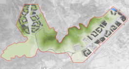
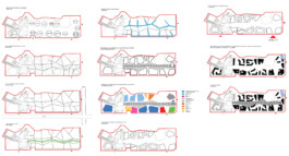
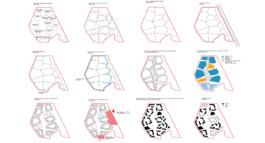
For both sides of the campus, the Upper and Lower Campus, we made a series of analysis to support this preliminary proposal of organization, accesses, configuration of the volumes and public space. These analyses are based on the reading of the surroundings, the actual needs for the program and the program itself, topography, adequate solar exposure, wind protection, setbacks, etc.
In the Upper Campus we defined several cells, which create a non-hierarchy configuration in order to give a similar condition to both students and staff. The urban character is structured by a main pedestrian central axis, which will provide to the core of the campus a lively area of leisure and recreation, but mainly a functional circulation, as a metaphoric structure much like a spine in the human body.
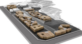
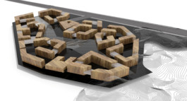
The cell division creates the configuration of the blocks which are fragmented as to achieve a better ventilation and solar exposure, and also shapes a “reading area” formed by 5 buildings following the principles of Hong Kong University, as requested. As an outcome of this process we propose five different but familiar buildings quarters, which are characterized with interior courtyards sometimes at different levels. These yards provide an intimate and cozy atmosphere for the students to use it as a meeting point, relaxation, informal studying or just to enjoy a close relation with landscape.
Amongst these blocks on an irregular pattern we locate the common buildings such as services and restaurants. These buildings are located in strategic points of the urban plan and centralized to better supply the needs of the surrounding student’s hostels and staff quarters. A strict and direct connection is generated.
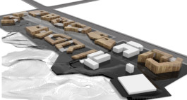
In the Lower Campus the same base concept was also used as a subliminal urban structure but adjusted to its specific land condition as well as the program required for this area. As in the Upper Campus, there is a main linear central axis with a pedestrian character connecting the starting area with the 1st and 2nd phases, giving the proposal a relational and sequential continuity, defining the overall Campus DNA. This axis was shifted and stretched to create informal squares or larger open areas near common buildings such as the Canteen, Library, and Auditorium. These areas stretch and connect the main axis into the realm of the other buildings, producing a nuanced articulation between shared space and public space, and provides the access’s and the circulation to the main structure.
The services such as atm´s, supermarket, post office or convenience shops were distributed along this axis, providing it with a convincing street atmosphere and transforming it in a main feature of public identity.
In both Lower and Upper Campuses the proposed blocks were voided as to provide a possibility for ventilation, solar exposure and views. On the ground level, these voids accommodate the possibility for an alternative circulation through the interior courtyards in between the buildings, which have an enormous richness and diversity of spaces and geometric compositions. These secondary paths become an interesting alternative space experience, unfolding the sense of place, with new points of view, textures, light, scales and landscape framings.
